
Exhibitions Auckland
GORDON H. BROWN
Exhibition activity this year to the end of April has been sluggish, with little emerging to quicken the heart-beat. Among the most interesting were three shows which shared certain common aspects, irrespective of the wide diversity of approach from the artists concerned: Frances Hunt, Patrick Hanly and Richard McWhannell. In varying degrees all retain an affinity with easily recognisable images while respecting the importance of abstract qualities.
However, the three displays were artistically haphazard in selection, and inconsistent in quality. This disunity, which prevented each show from attaining the advantages of a well-planned, cohesive exhibition, did, in a rather unintentional manner, give each something of the air of a limited 'survey exhibition'. As much as each selection contained negative elements (in the sense that the work displayed that did not exactly enhance the reputation of the artist concerned), each afforded examples of work that offered more than just passing interest.
Richard McWhannell New Work/Old Work
Of the three artists, Richard McWhannell is, as can be expected, the least mature artistically: but his best work stands well. What was offered in his display was a gathering of works in hand on the eve of his departure overseas. The work showed a diversity of media: but this diversity also revealed a gap between his best efforts and what was less admirable to an extent greater than with Hanly or Hunt.
If far from satisfactorily resolved, McWhannell's early watercolour portrait heads have the added dimension of showing the extent of his early contact with Sir Tosswill Woollaston: as well as the extent to which he has since removed himself from this influence. Traces still remain, with the most obviously persistent assuming a negative function, while the positive gains have achieved independence and an individual character. This transformation can be observed in a recent watercolour portrait, Donogh 1982, which, while retaining the somewhat contrary effect derived from a messy area of flooded colour, is retrieved by the imposition of a more disciplined control over the main forms of the head, with its sharper definition, especially the profile line.
It is this tendency to produce vague areas of tone-colour, which read as visual blanks, that results in an indecisive fuzziness. The tendency is more apparent in the watercolours but is also present in some of the landscape paintings. Sometimes the fuzziness can take over the background area in a fairly generalised way. It can also produce an ambiguous image in otherwise well-ordered paintings - as with what might vaguely appear to be a hedge in the central area of Converted House - Federal Street 1981.
In the better of McWhannell's recent paintings he has adopted a form of realism that has affinities with the stronger aspects of the simplified realism of the nineteen-twenties and 'thirties. This is noticeable in the blend of realism and classicism which becomes pronounced in some of the portrait heads. In Portrait of Hamish 1982, the almost classical rotundity of the head and the generalised definition of features has a unified control not found in the watercolour heads (at least in this exhibition).
At its best, McWhannell's restricted selection of detail heightens the impact of what might appear to be fairly ordinary scenes. This is seen to advantage in Security Gate, New Years Eve 1981-2: a work that is carefully thought out in terms of composition (with its juxtaposition of close-up detail set against the more distant forms of the main architectural imagery), as well as bringing to the fore McWhannell's ability to make use of strong, if soft, colour harmonies. In such landscapes their success relies also on the quality of the light which illuminates a scene. When these qualities are lacking (as they were in several of the landscapes on show) the results can be fairly ordinary.
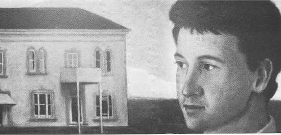
RICHARD McWHANNELL
Pleasure Palace 1981-2
oils
(Denis Cohn Gallery)
When the impression of compactness and controlled imagery are combined with sombre atmospheric light and carefully muted colours, the results create a definite mood that is at times almost lyrical in its overtones. This was most apparent in Pleasure Palace, 1981-2, one of the highlights of the show. The combination of the close-up, three-quarter-view, young man's head in the right foreground, the middle distance building on the left with its grey walls, pink facings and dark roof set against a distant landscape and darkening sky, showed the world McWhannell creates as quiet, orderly, timeless-with an almost romantic undercurrent, or mood, that is less easy to define.
Patrick Hanly Homework
Hanly's exhibition contained about fifty items in various graphic media: mainly working drawings and studies, with a small selection of original prints. Many of these he described as 'back-to-basics exercises essential to the resolving of graphic ideas and themes'. It was a mixed lot, but contained gems. Many of the work drawings and studies could be related to Hanly's paintings-often showing other aspects not always present in the 'finished' painting-while some have a relaxed quality not found in the more deliberate pictorial statements.
Such was the case with three small versions in black for the Pintado Protest painting of 1976 (see Art New Zealand 11). Allied to these preliminary drawings is another larger drawing dated 1979, The Gap, Piha, which is close in both style and superficially in the general impression of its imagery. This sort of loose affiliation has become a common factor in Hanly's recent works.
Among the landscape drawings, this tendency to recapitulate earlier work was demonstrated in an item in colour drawn in 1977, Sunny Side, which recalled his series from about 1968 titled Inside the Garden. A number of other colour drawings like Summer Farm 1977, Mt Eden Walk 1981, or the pencil drawing Garden Energy, developed elements contained originally in the Inside the Garden series, to which are added a newer, more decorative element: at the same time glancing back to Hanly's early Picassoesque influence in the use of full, florid forms not unlike certain shapes that Arshile Gorky also gleaned from Picasso (though no influence here is implied) But Hanly is too good an artist to simply repeat his earlier successes. However close an image or set of allied forms might be in what they echo, they remain summary statements upon which new material and attitudes are overlaid.
PATRICK HANLY
drawing for Pintado Protest 1978
ink
(collection of the artist)
Other drawings fall outside this range and return to a very conventional and conservative outlook. Summer Storm, with its simple, straight-forward statement and impressionistic colour and forms belongs here. The pencil drawing of the upper portion of a woman with her head resting on a pillow, C. Study, exhibits this aspect to the degree that it could be taken for a competent art school study. However, most of the figure drawings are looser and more relaxed. Ink drawings like Drawing in the Garden 1978, or the pencil drawing Good Girl 1981, reveal the best of Hanly's unpretentious response to the human figure: a response that reveals as much about the artist as do the studied, finished works. Among the figure drawings worthy of particular attention was a group of three small, colour drawings (in pastel or crayon), Barry Left and Model, Gentle Model (which is an almost identical enlargement of the model in the previous drawing) and Relaxing - all apparently from the same session sometime during 1977. The use of colour and Hanly's skilled shorthand rendering of the figures give this set an expressive quality and verve that represents the artist in his best and most relaxed style.
With Hanly's prints, all the pressures of an artist struggling to maintain a pliable balance between the eclectic element in his work and his search for an original way of stating things pictorially are manifest. The Tour Division was a fair example of this among the prints displayed. It represents very clearly the situation in which Hanly now finds himself as a serious artist.
To a considerable extent Hanly has become an artist trapped by his own past - falling back for his artistic nourishment not only on pictorial images like those derived from his Figures in Light and subsequent series, but also continuing to rely on his past mentors, such as Picasso and other modern masters. While one can sense a quiet though desperate struggle taking place in his attempt to reveal himself, there is also present an acquiescence that appears to accept the situation for what it is. Despite the use of political or social ideas to direct his choice of imagery, the profundity of such statements does not enter deeply into the fabric of his work (irrespective of how firmly Hanly may subscribe to such an ideal as a person).
A print like The Tour Division is easy to read superficially, with complacency depicted on the left side and dissension on the right: but as a political statement it remains on the surface. What is more real is Hanly's natural optimism, his sense of urgency and buoyancy underlying the structure of such works. At this level Hanly's symbolism takes on greater meaning: for it derives from the heart, and responds to an intimate assertiveness that is more decorative than it is intellectual` or attuned to the realm of high politics and protest.
Frances Irwin Hunt Painter and Collector
This exhibition of eighty works by the late Frances Hunt came close to being a retrospective. However, though it spanned much of her working life, the necessary research to organize the works into a meaningful 'chronological arrangement . . was not feasible'. The exhibition included works by other artists which Frances Hunt had collected. (Reference should be made to E.H. McCormick's article on the artist in Art New Zealand 22 for background to her work and collecting.) Some pertinent items were included in this latter activity of Frances Hunt's, such as a fine early 1920s gouache by Frances Hodgkins, and good watercolours by Frank Wright, Frances H. Wright and Alison Pickmere; but these are outside the scope of the present review.
In many respects the work of Frances Hunt reflected the tug and undercurrent of uneasy allied forces that permeated so much of the painting produced in Auckland during the nineteen-thirties, 'forties and early 'fifties - the alternating influences of Archie Fisher and John Weeks. In their ways, both men promoted a degree of modernism: but the underlying aesthetic base for each was diametrically opposed. Whereas Weeks had some understanding of the use of flattened, over-lapping planes and an approach to handling pictorial space that was in line with Cézanne and the Cubists, the doctrinaire approach of Fisher was dominated by a theoretical application of Italian Renaissance three-dimensional form that had become quite alien to the concept of modernism. (This pseudo-Leonardoesque form was well demonstrated in the drawing of heads by Ron Stenberg in the exhibition.)
This underlying dichotomy is present in Frances Hunt's work. Only rarely is it satisfactorily resolved. It is worth noting that the most successful of her watercolour landscapes are in the conventions that prevailed earlier in her career, when she had studied at Frank Wright's academy. None of her later watercolours match the reasonable solution to the problem found in Alison Pickmere's watercolour Behind Milford.
The Fisher influence is obvious in the portraits in oil. Even at their best, as in Maori Girl in Red, the theoretical aspect of rotundity makes them retain that slightly forced, awkward appearance which marks so many of the portraits produced in Auckland over this period.
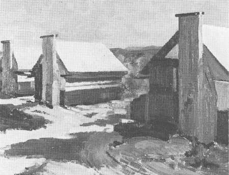
FRANCES HUNT
P W D Tents
oil on board
(John Leech Gallery)
Much the same applies to the landscapes. Within this convention Frances Hunt's most convincing landscapes, (mainly because of their stronger, unifying rhythm) are of rivers flowing between steep, fully rounded hills - as in Early Morning King Country c 1940 and Mangaokewa Gorge c 1939. Much happier in their visual solutions are a couple of landscapes in which buildings play a dominant role: P. W. D. Tents, Taupo Pumice Country, April 1939 (very close to the painting of the same subject in the Auckland City Art Gallery) and Cityscape. In these two works the forced rotundity is replaced by a greater skill in playing off one flat plane against another to build the structure of the painting: a solution in line with Weeks's approach, the result of which shows Frances Hunt at her best.
The influence of John Weeks is strongest in the series of Still Life Compositions of c.1959-63, the best of which certainly show a genuine appreciation of abstracted forms and paint quality, even if their resolution fall just short of being completely satisfactory.