
Artists in Auckland University's Arts/Commerce Buildings
STEPHEN ELLIS
Project art is a novelty in New Zealand. An absence of patronage has meant no big art and no big projects involving artists and architects. Artists may have been called in at the eleventh hour to decorate what an architect has provided: but the degree of co-operation and consultation between the two disciplines on Auckland University's recently completed Arts/Commerce buildings is a whole new thing.

DENYS WATKINS Marine Ply 1984 mixed media
If institutional spending on art is another whole new thing, it's still largely voluntary. For more than ten years Auckland University Council has been voluntarily committing 1½% of its new building budgets to art works for those buildings; since June 1975 by appropriation if necessary. The University's first project under these conditions was the Medical School, where Hamish Keith found compatible works and walls. Pat Hanly performed the same juggling act for the Architecture School. Hanly was Fine Arts Consultant to the architects of Arts/Commerce too: but, with the ½ % totalling $140,000 and seven years of planning, consultation and production, the process was considerably more involved.
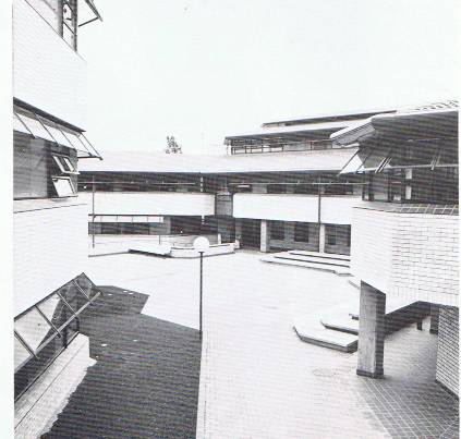
Quadrangle, Arts/Commerce Building, University of Auckland
In 1977 the JASMAD group started planning, Ivan Mercep set walls aside for art works at the earliest stage and although he had a complicated brief to contend with he was sympathetic to the needs of other disciplines. UGC ratios and formulae meant that the public spaces in Arts/Commerce would be small and `domestically-scaled', so Mercep included large non-domestic wall-spaces for works of art.
MALCOLM HARRISON Untitled fabric piece 1984
By mid-1981 Hanly was looking for artists for the project, submitting cartoons to the architects, clients and consumers, and giving architectural drawings and colour swatches to the artists. Complicated consultations guaranteed the acceptability of works, and by mid-1982 the art works had been commissioned and contracted from sixteen artists. Hanly's policy had been to represent as many woman artists and as many schools as possible, to make no distinctions between disciplines, and to make all contracts and payment standard.
Despite Mercep's efforts the architectural opportunities weren't the same for all artists. The Commerce building is lower than the Arts block, its walls and windows are smaller, although all the sites are in high traffic areas and are angled to catch the most attention. Hanly juggled names and sites very carefully and when pairing sought to oppose conflicting styles.
The variety of wall-spaces is much less remarkable than the variety of responses to them, and it's in their architectural context that the pieces must be judged. All sixteen artists responded to the architecture in one way or another: some accepted it as a setting, others exploited it, some challenged it.

JAMES WALKER Untitled glass work 1984
The glassworks of Holly Sandford and James Walker are of the accepting' type, using the building as a setting for some virtuoso displays of craft. Sandford produced the impressive long drop of glass in the Arts building; Walker's single windows are in foyer areas in the Commerce block. Don Binney accepted the setting too: his bird-and-landscape is more a painting on a wall than a wall painting. Although it decorates more than it defines it's popular with the building's users. Quentin McFarlane's Sailing, in the Commerce entrance foyer, was forced to accept its surroundings: his wall is complicated by doors, corridors and seating and a small discreet painting echoing the colour and some of the forms of its setting was the best solution. In his use of elements of the architecture McFarlane is exploiter as well as accepter.
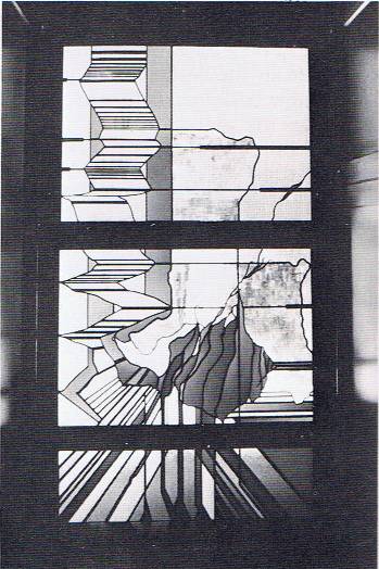
HOLLY SANDFORD Untitled glass work 1984
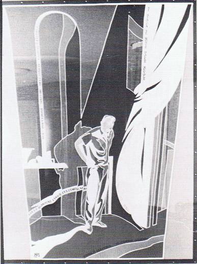
By far the most impressive of the `exploiters' is Rob Taylor: his Lithic Link on the top floor of the Arts building uses its entire wall, although it's on a stretched canvas. It exploits the architecture so successfully that it seems to drain energy from it. Essentially a landscape, Lithic Link would suggest a view from its landing were it not obscured by the brutal Human Sciences building. Terry Stringer's Past in Perspective in the street-level Arts foyer exploits in quite a different way. As the title suggests it is one of Stringer's perspective games —using only a small part of the wall to involve the whole wall in the game. A relief head on a relief pedestal borrows colour from the setting; and a forced perspective backdrop fattens the reliefs and twists the wall.

TERRY STRINGER Past in Perspective 1984 bronze with oil on board
The third `exploiter' is Buck Nin, whose Rangitoto triptych steals from the architecture in a less dramatic way. Nin uses the low ceiling and dim light of his Commerce foyer to accentuate mood and message: the Maori Land theme of Rangitoto draws vigour and support from the timber mouldings and earthy colour around it. It's a difficult wall too—always partly obscured by a pillar.

CAROLE DAVIS A Degree of Celebration 1984
The `challengers' are the most common type, and perhaps the healthiest. There are degrees of challenge, of which the quietest must be Suzy Pennington's. Pennington is a fibre-artist: her Beyond Horizontals hanging is a subtle challenge to the efficiency of its surroundings. Carole Davis is another fibre-artist: Degree of Celebration contradicts its surroundings with its forms and colour; it's an impressive hanging, borrowing from graduation gowns and the architecture of the old Arts building. Malcolm Harrison's untitled fabric piece for the Romance Languages department takes its imagery more obliquely from outside. It's a masterfully crafted-piece stitched with slogans in suitable languages. Some of Harrison's colour cooperates with the surroundings, but the force of the work is in its durable obscurity.
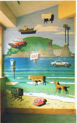
GEORGE BALOGHY Untitled Work 1984
George Baloghy's contribution is also appropriate. He has filled every square inch of has awkward Commerce wall with one of his characteristic landscapes—the land sale message being appropriate to Management Studies on the same floor. By filling his oddly-shaped wall Baloghy subordinates the architecture—Denys Watkins can do the same trick in half the space. Watkins's wall, like Nin's, has an intrusive pillar: Marine Ply dispenses with it altogether. Watkins has borrowed enough colour and texture from the architecture to make him part `exploiter': but the effect of Marine Ply goes far beyond coincidence; it's a spectacular painting full of Watkins's flippancy and panache.
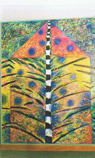
PHILIPPA BLAIR Tree of Knowledge 1984
Philippa Blair's Tree of Knowledge in the Arts block is the most vivid challenge to Mercep's architecture. It's chaotic, jungly and folded like her recent work, the uproar of paint subduing the building around it and Suzy Pennington's work hanging on the opposite wall. Like some of the other artists Blair had some trouble backdating her approach, matching a finished product to studies done two years previously: an understandable difficulty which doesn't show in Tree of Knowledge.
CAROLE SHEPHEARD Four Directions 1984
Carole Shepheard's Four Directions is another active challenge. There's enough activity in two and three dimensions to separate Four Directions from a setting which includes the passive Binney. The artists' contracts required durable art works for a busy institution and Shepheard's little sticks and strings are much tougher than they look.

Ground floor, Arts building,showing Claudia Pond Eyley's Mount Eden Landscape with Gate
Down on the ground floor of the Arts block are Claudia Pond Eyley and Richard Killeen. Eyley has successfully backdated Mount Eden Landscape with Gate which exploits a, little and challenges a little. The lush Mount Eden landscape defies the angularity of the architecture while the gate exploits a feature of it: the bottom of the stairs in this space is closed off with steel gates. Richard Killeen's Appropriation is a gem, made up of familiar and unfamiliar cutouts. Unlike the others, Killeen strays off his given wall; the cutouts parade around a corner evolving from left to right or right to left. All the simple amoebic shapes are at right and left; in the middle are more complex symbols more complexly painted. Appropriation is a subversively suggestive piece, entirely suitable for an academic setting.

Ground floor, Arts building, showing Richard Killeen's Appropriation
Artists, architects, clients and consumers are all delighted with the results of this project. The planning and consultation have been justified: Mercep would leap at the chance to do it again. And if there's a conclusion to be drawn from the success of Arts/Commerce it is that an architectural interest in art and artists will always be repaid ... with interest.