
Exhibitions Auckland
GORDON H. BROWN
George Baloghy Nudes and Cars
With George Baloghy's recent exhibition - a small display of ten works - there is a change in the usual medium he uses, the new works being watercolour-drawings. In spite of the change in medium, the general technique used to present his imagery has not greatly altered from his recent paintings. This sense of similarity confirms the graphic quality that underlies his technique. However, in the new works there is one main difference. Each of the watercolour drawings have a distinct border area surrounding the picture: an aspect rarely found his paintings. It is not a margin of strictly regulated dimensions, for the border- line is usually slightly off true alignment. More significant is the fact that images from the picture itself overflow the line of the border and intrude into the margin. This occurs in all the watercolours, but is more obvious in some than in others.

GEORGE BALOGHY
The Annunciation 1982
watercolour on paper
(Denis Cohn Gallery)
It is, however, the imagery itself, and the use to which Baloghy puts it, that is the dominant element in his work. As in the past, in these new works he draws upon the viewers' knowledge of well-known paintings, most of them masterpieces from the past, as points of departure to underline what he wishes to convey.
The nervous yet controlled black line contains a simplified rendition of these familiar works of art, edited for his own purposes and presented in a highly generalised manner. What counts is a recognisable impression, with no place for the nuances associated with the original pictures that are the source for Baloghy's 'art' images. These paintings are merely pegs for ideas. They are points of reference against which other images of an alien natures are juxtaposed to convey in a visually metaphorical manner the ideas the artist desires to bring forward. The single image to invade the pictorial images gleaned from other artists is that of the motor car: but such playing-off of one period of time against another is backed-up with other images of a contemporary nature derived from modern suburbia.
The degree to which this mixture of cultural periods is applied more or less occurs in three stages according to the way Baloghy utilizes the sources of his imagery. In Luncheon on the Grass a modern motorcar with a parking meter intrudes into the luncheon party of Manet's famous painting of this subject. In Jervois Road, Giorgione's Sleeping Venus reclines on the footpath next to a parked car, while the Titian landscape that accompanied Giorgione's nude has been replaced with a suburban street scene. In the Annunciation the architectural setting from Fra Angelico's well- known painting is retained, but the angel and Mary are shown in modern dress; while to the side of the porch stands a parked car, presumably the vehicle that has transported the angel to the location where his divine message is about to be announced.
This work, in the general context of the exhibition, has the distinction of being the only one in which the female figure is not shown as a nude In this respect the use of the modern advertising cliché, of lowering consumer resistance by the inducement of an appealing female nude to help in selling a mechanical object like a motor vehicle by subliminal association, can be seen as the rationale behind this series of ten watercolour drawings.
It is significant that the one work which fails because it follows too closely the ad-man's cliché is Coromandel Summer. In this watercolour the 'art work' Baloghy has introduced into his picture is that of a nude derived from the American Pop artist Mel Ramos. The result is too much like the real thing rather than a pointed comment on this type of advertising method.
Don Driver Pockets and Tools
The large collection of wall-hanging works by Don Driver that filled both galleries at RKS Art earlier this year was the best show mounted by Driver at a dealer gallery for several years. one needs to go back to the New Vision Gallery exhibition of June 1978 for a display of his work in which the items on show maintained a consistently good level of artistic achievement. To some extent the recent exhibition showed a consolidation and refinement of the elements that have become a feature of Driver's work over the past seven years, although these features were present in embryonic form in his earlier work. What was particularly, noticeable in the new works was the almost classical orderliness of approach to assembling his compositions. In this respect, some of the most formal works were also the best by virtue of the skill by. Vhich the various parts had been assembled into a balanced work of art. Underlying this formal attitude to his art there is also a sense of relaxation in the way this orderliness is applied and it is this quality that prevents any inhibiting rigidity.
The very nature of Driver's work, which has the two- dimensional properties akin to painting played-off against the three-dimensional properties of sculpture, is what gives it such liveliness in the possibilities it allows the imagination. This vitality resides in the ability to combine unusual materials - either for their properties as materials, or as potent objects with a suggestibility that extends beyond their qualities as visual entities at a material level. At one level such a utilisation of material objects may carry overtones which can be sensed as part of the orderliness of a work's arrangement, yet goes beyond this to convey qualities it is difficult to be specific about. This is true of the visually interesting materials in 112 lb Pocket with its basic ground of blue plastic sheeting on to which is stitched a produce bag (from which the title is taken), two bits of old green canvas and an oblong of dark crimson velvet material. At a more accessible level is Saw Pocket with its various bits of canvas, old sack, large saw bag complete with pocket and from which juts a saw handle: all of which take on a somewhat earthy character through the objects combining to produce a colour scheme based on several shades of brown.
Both works make simple visual statements unhindered by any clutter. As with most pieces in the exhibition, it is a simplicity with a variety of reverberations, textures and colours derived naturally from the materials used and which are not only combined by the artist with sensitivity allied to boldness, but have the paradox of making credible works of art out of our civilization's junk and trivia. It is a synthesis that arises from a feeling for the imaginative possibilities derived from natural and synthetic materials combined with an easy sense of style.
Much as Driver's use of cast-off objects fit into an international approach to art, the overtones they carry are closer to New Zealand that is often found in the work of other artists using similar junk where the overtones are more suggestive of the United States.
Philip Clairmont New Paintings 1981- 1982
Philip Clairmont's exhibition of twenty- three recent oil paintings, mixed media drawings and woodcuts (some hand- coloured) was dominated by the painting on canvas: more because of their size than for the consistency of their quality as paintings. Some of the most successful works were among the smaller items. As is often the way with a Clairmont exhibition, the quality of what is displayed is uneven: but to some extent this inconsistency results from the hit or miss nature of the artist's working method. While there may be rare instances where his work could be described as sloppy in the delineation of image and in the application of paint - in this exhibition the Study for the left-hand panel of Large Triptych borders on this type of carelessness the bravado element from which such failings arise is also the same source that can impart into his work some of its strongest and most persuasive qualities. The uncertain qualities that this bravado can bring to Clairmont's work is an aspect which goes with the hit or miss approach, but when everything works artistically in a well co-ordinated manner, then the results are well worth waiting for.
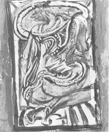
PHILIP CLAIRMONT
Study for Crouching Nude 1982
mixed media
(Denis Cohn Gallery)
If there were no master-works in Clairmont's recent display, there were some which showed many of his admirable qualities, while others, if of mixed success, still held considerable artistic interest.
For all the potential power of the large Triptych: Three Reclining Nudes, only the central panel of the woman in the bathtub approached total visual satisfaction with some measure of fullness and sensuousness of form and unity as a painting. As in some of the other works on display, the two side panels provided images that were too often in a state of flux, moving toward well-realized details in respect to certain forms, but also failing to integrate these details satisfactorily into a total unity as a single work. In presenting the nude figures in the two side panels various parts of the bodies seem unduly disjointed; and in one of the figures, the head has the appearance of being dismembered.
From among the larger figurative paintings Seated Nude (Rachel) was shown more convincing. Viewed from the back, the nude is shown seated on a chair the back-rest of which has visually disintegrated, yet in a way that is not too disturbing for its general shape to remain discernable; but this allows the well-defined torso of the woman to be more clearly visible. The result is a strong image that is strengthened by the supporting imagery of the yellow chair and the red and blue zig-zag design of the floor covering.
Like the Triptych, the Large Window Painting contains some well-conceived and suggestive images: but these are seen in scattered isolation against the somewhat disorganised totality of the painting. Scarred Couch Painting No 2 works almost in reverse. When seen close-up, the way in which the details function as co-ordinated images is not very clear among the streamers of swirling colour and linear rhythms creating a lively surface yet leaving the total unity of the imagery almost undecipherable. Only when the viewer stands back some distance from the painting does the couch reveal itself in its agitated state.
A similar and even richer visual experience was found in one of the smallest works in the exhibition, Study for Crouching Nude, but this quality had more to do with the mixed-media used than with the delineation of the imagery. On the other hand, the relatively straightforward working drawing for the large Triptych, Rachel Reclining (Study), had the clearest and most carefully defined imagery in the exhibition.
Prominent among the smaller works was a set of mixed- media drawings showing a window with still-life combination of which Window, Edenvale Road (in oil, ink on card) was the most direct and simplest; while others like Window, Miro Inverted: Mangamahu and another Window, Edenvale Road (crayon, pencil and ink) possess an imaginative, emotive power that adds a completely different dimension.
The most forceful of the woodcuts, Magic Mirror Triptych, showed a three-way, dressing-table mirror in which objects in the room were revealed by reflection - the dominant image so revealed being a window with curtain.