
The 1978 Benson and Hedges Art Award
GORDON H. BROWN
Despite the misgivings of some, the Benson and Hedges Art Award still serves a positive function. Selection is pretty much a game of chance. It is probably conditioned less by the judge's choice than by the list of artists who choose to submit paintings in the first instance. In a way, such awards highlight the advantages and shortcomings arising from this type of sponsorship. As is well illustrated in the 1978 exhibition, the selection results in a number of artists being introduced for the first time to an enlarged audience on a national scale. Useful as this sort of exposure can be, the exhibition's over-all view hardly presents a balanced cross-section of New Zealand painting. Though the selection may be of current work, it cannot truly reflect the present. The variety of it may well be visually stimulating: but as an exhibition it cannot be entirely satisfying intellectually.

DENIS BOURKE
Geomorph
oil, 1193 x 800 mm.
The landscapes in the 1978 exhibition offered some relatively unexplored subjects: but their innate ability to convince the viewer at a purely pictorial level was debatable. If Susanne Herchell's tidy, stratified landscape grew less convincing the longer it was contemplated, Julian Bechelli's sombre version of Rain may have made better sense had its pictorial rationale been consistently followed through. Displaying greater unity of purpose, Denis Bourke's double, systematized Geomorph landforms presented a visual idea that at least seemed to have the pictorial merit of moving in a useful direction. Peter Siddell's intricate rendering of a cityscape was intriguing: but, while his dexterity can be admired, he again failed to implant an underlying compositional structure with sufficient strength to satisfy the critical viewing eye. Bordering on the genre, the conspicuous painting was Patrick Hanly's Pintado Protest. Though not so well-composed as some of his other recent paintings, as a protest it had a direct forcefulness that carried conviction without overstatement. As a work viewed in painterly terms, it supported sufficient dynamic power to compensate and surmount the more orderly, decorative element common to many of Hanly's recent productions.

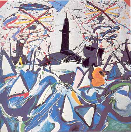
WONG SING TAI
Pacific Harbour
acrylic / perspex, 2133 x 1231 mm.
Where the figurative motif appeared, the results were either moderately appealing or simply disappointing. Both Wong Sing Tai and Dick Frizzell operated below par. Although the former's Pacific Harbour contained some amenable details and possessed a fresh, competent technique, the images occupying the centre of the painting disintegrated, so that what purpose they were to convey became confused. Dick Frizzell's large panel was both awkward in arrangement and imagery: while the painted surface lacked that sensuous handling of the medium which in other works has often been his saving grace. Much more assured and convincing, if on the light side, was Bryan Poole's Come Hell or High Water. But when it came to the sensuous manipulation of paint, Alistair Nisbet-Smith's Playground displayed an appropriate regard for combining fragmentary images with a fertile and deceptively casual technique. This was not the case with the photo-realist rendering of Deborah by Gary Waldrom, where the brushwork failed to comply with the realistic forms it should have established. Although the intention was different, a similar fault can be pointed out in Pamela Wolfe's flat treatment of clothing contrasted with the semi-three dimensional shading of heads and exposed flesh: though the juxtaposition of colour and the careful placement of objects allows this factor to be partly rectified. If illustrative in style, the double Portrait of Gene and Arthur did show her at her best. Far more weighty in subject and style was Nigel Brown's semi-dramatic stage scene, but as I fail to summon up sympathy for his work, I will leave it at that.
Among the abstractionists, Ian Scott's Lattice No 45 held the viewer's attention through its sheer efficiency. Part of the work's validity comes from the self-contained nature of the lattice image: with the thin white stripe just inside the edge of each broad band playing an essential role in consolidating the image. In some respects, the interplay between the various shallow triangular shapes that make up Richard Killeen's Assimilation is just as subtle; while the spatial nuance set in action by the single white triangle in relation to the rest is conclusive, if visually demanding on the viewer, in releasing its effect. Also constructed over a grid, but a less regulated one, Allen Maddox's criss-cross motif contains both the virtues and faults of its own simplicity. One felt the cruder brush strokes may well have resulted from the painter's attempts to keep the motif alive. Similar thoughts crossed my mind in relation to Ray Thorburn's Grid Structure I: but as it was not shown in Auckland, and my previous sighting of it had been brief, in holding this view I could well be unfair. This is not the case with Michael Thomas's op-style painting, which was clever but grossly overstated. The schematic aspect was much better tackled in John Bailey's restrained, up-dated six-panelled work, 4 into 25: Three Rhythms, which clung to the conceptual movement for its basic idea of rearranging its component parts.
PATRICK HANLY
Pintado Protest
oil / enamel 1219 x 1219 mm.
The other non-figurative paintings inclined towards the lyrical. This was definitely so with Gretchen Albrecht's Illumination (Shaft) where the pale rose-madder colour-spread had been smoothly floated on: but what effect might have been achieved had the darker shaft been omitted? In a way, something like the reverse could be said about Ian McMillan's Garden. As a formal composition it had much in his favour: however, although the paint application was delicate, often the most sensitively-handled areas were those where greater visual strength was required. Another painting that could be measured in sensitivity was Rica Series, Number 1. Eldred Wisdom's collage relied on delicate nuances, and the irregular, pale, fragile images imparted a pleasant ethereal quality, but the total impression seemed a little dated. This might not have been so had the blue textured background extended across the entire picture surface. Malcolm Benham's Arrowhead, 2 displayed a technical finesse that resulted in an ordered surface both simple and complex in imagery. The manner in which the painting hung gave an impression of an intricately-patterned wall-carpet, even if some factor involved in the total effect failed to jell completely. Considerably stronger in vigour, Robert McLeod's Big: Brown: Brutal with its astringent colour and brushed and splattered orange-brown surface geared up with flecks of green, would have read with greater satisfaction if he had avoided the temptation to overdo the splashed, mottled areas to the right and left on the canvas.
If only a few of the twenty-three paintings conveyed real conviction as works of art, the exhibition was still worth viewing - if for no other reason than as a facet reflecting the current state of painting in this country.