
Max Gimblett's Works-On-Paper
In this conversation Wystan Curnow talked to Max Gimblett at the Barry Lett Galleries on the occasion of his exhibition there last May.
Wystan Curnow: When I wrote on your last show I didn't say anything about the works-on-paper. More recently I've been wondering about the relationship between them and the paintings. There's a difference, isn't there, between works-on-paper and drawings? You refer to yours as works-on-paper.
Max Gimblett: I guess they're paintings on paper.
W.C.: But as works on paper do they have the status of drawings in the sense that they are preparatory for painting, or exercises for painting?
M.G.: Well, they're done before and after paintings. It's one of the ways for me in which colour emerges. Colour emerges kind of on a daily basis. It comes a number of times during the day - in all the different ways that colour does come. And then there are drawing aspects: scale, proportion. There's the kind of thinking going on that is a drawing function, that's not fully covered by painting. And there's experimentation, exploration. Somehow none of those categories tie it down. They're colour sketches and paintings on paper and they're also drawings. Because we mustn't think about drawing as just line.
W.C: Maybe it's like an artist will keep a sketch-book, as a-day-to-day activity, for notes.
M.G. Right.
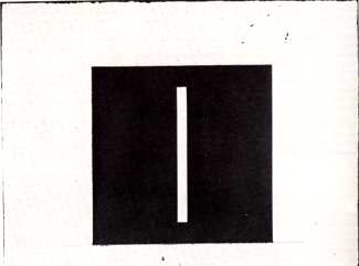
MAX GIMBLETT
Untitled Work-on-paper
acrylic, 556 x 804 mm.
(Barry Lett Galleries)
W.C.: The other thing that occurred to me about them is that they are distinct from paintings in that you don't cover the whole piece of paper with the image - that the image is definitely placed on the paper, and it has what becomes a kind of mount of white paper around it. In that sense they seem to be something less than the paintings, as objects, as things. Do you think of them that way?
M.G.: Well, one thing I notice is my paper. This is three and four hundred pound rough watercolour, Arches and Fabriano: so it's a piece of paper that I stands up on its own, a very thick piece of paper; it's hand-made paper so it's got its own edge. A literal reading around the image is wall, a colour reading is white. And also there's an infinite reading so that, as it's set in space, often there's the range of aerial imagery that comes in. Something is right out in space. A tiny drop of paint around the image might seem like a star or a planet. But more than all this, I think probably what we're discussing is framing - and the way that one focusses in and out of ideas and contrasts, thoughts and images. So we've got the camera, TV, and, eyes: where the eye stops seeing we start framing.
W.C. You said that, in a literal reading, the area around the image can be read as wall. Does this transfer to the paintings, in that you see the paintings as participating in the wall when they're hung?
M.G.: They participate in as many spaces as any viewer can imagine being in. I've always been interested in a notion about what we all see. I really don't know what's there when I see. Because I see differently at different times: always seeing anew, always refreshed. And what I see isn't perhaps a big element in terms of what's there. In terms of the space between what is literal and what is illusion - I wouldn't want to limit that space, I'd want it to be huge. Paintings are on the wall, and of course they refer to so many other spaces. The fact that this image is nearer the bottom than the top for instance. . . I can have a gravity reading on the bottom of that, so that it's earthing-out or grounding-out.
W.C.: Yes. I notice that most of the drawings have that pencil line drawn across the bottom which extends out both sides of the image.
M.G.: Yes. I also do ink drawings. So there are the ink drawings; these colour notes or sketches; and then the paintings.
W.C.: What are the ink drawings? They're not line drawings?
M.G.: They're not just line drawings, they're wash drawings - they're line and mass.
W.C.: In a lot of ways the works-on-paper are very similar to the paintings themselves: but the most striking difference is scale. And there is a sense of gesture involved, with the drawings and with the paintings - if only from the odd splashes and the obviously hand-painted images. The difference in gesture of course is enormous in terms of the physical act of making them. One is small-scale, the other is large-scale. Can you say anything about that?
M.G.: Well, there are several things. There's a chance that these may be true miniatures - if, sometimes, they achieve immensity, which is what happens when a miniature is 'working'. So that's scale. The other thing is: a painting that is ten inches higher than I am is a total body thing. The viewer's look at a work-on-paper has always struck me as a head thing. There's less body involved. It's almost like a self-portrait. You can measure it with your head and your eyes. You don't have to have a full body reaction. So that there is gesture: but it's a certain form of calligraphy perhaps, a different sort of mark. And being so much smaller, it moves toward drawing in that your elements get very defined. And where you learn most that it's hand made is at the edges.
W.C.: Could we talk now about content, or the absence of content, to put it simply. People may look at this sort of work as very simple 'design', and wonder how it is that all that effort has gone into a very simple motif. I'd like to try to move this discussion into the area that seems to be evoked by the titles.
M.G.: The 'hooks'.
W.C.: Yes. It seems to me that these works consist of an image, rather than just a design motif. But would you want to go so far as to call the image you use a symbol?
M.G.: Well, there's 'symbol' and 'sign' and 'image' and 'motif'. It wouldn't be acceptable to me to fix on anyone of those - but I could accept all of them. That would be more expansive and more exciting than getting stuck, say, just on 'symbol'. If someone was seeing 'design' then I'm afraid I really couldn't help them very much. It seems to me that what one should be trying to do in front of a painting is look at it. And if one looks, in time, one will have experiences. If one can't stop and look, one's gone by it. There are 'hooks' whereby people begin to look: one of those would be association; and so symbol sets that off in me: I'm aware of some readings. But my readings are just my readings. I don't know about that. I find out about that when I get input back from people who have looked at my work or other people's work.
W.C.: To continue on these lines...
M.G.: It's a meaty area...
W. C.: Would you say that the move from two bars, one down either side of the canvas, to a central bar is a 'meaning' shift to you - does that indicate a shift of meaning?
M.G.: Yes. And I have the sense of having an emerging vocabulary. Hence the emerging possibility of language. And that's how I fuel myself along.
W. C.: These works on paper - more than the paintings - give one a range of visual experience. I could divide up that range most simply by saying that some of them give you a highly volatile visual impression, and others give you a quite peaceful, slowed-down, cool one. There are 'hot' and 'cool' ones. And in the hot ones that bar becomes the sort of thing people think of when they think of Op art - it does a lot of jumping around. It works laterally right across the image. When it comes to the quiet ones, that doesn't seem to happen at first. But it does after a while I think - more slowly, more quietly.
M.G.: Yes. There's a number of spaces. There's space in front of the bar, space in behind the bar, there's a concave and convex space, there are circles described, there are circles in space in front of the work; and then, depending on the colour, on the axis there's deep space, and space way out front, and space pressing forward: all these different spaces.
W.C.: Right. And do you have a sense of those poles - one a very energetic, hot, tense pole, and one a very quiet, peaceful, meditative pole? Do you have those poles in mind?
M.G.: Yes. There's the cool and warm side of the spectrum. Certainly there's a great sense of duality and a great sense of contrast. And plenty of paradox between duality.
W.C.: Do you have the feeling that these are distinct feeling-states?
M.G.: When I was beginning painting, I wrote down about six categories - like 'romanticism", 'lyricism', 'classicism', 'visionary', 'expressionism' and so on. Then I grouped a whole lot of body states, and a whole lot of conceptual states, as to how one would feel before and after and during the work. . . and so the answer is yes. But there's a whole lot of edges there that bleed. Of course. But we do start . . . like . . . I read Paul Valery a lot. . .We can begin to group our impulses so we are very very aware, when we are in a feeling, that it's different to how we were aware before. We can get very developed about how we are modulating a very fine feeling - and hopefully that's in the work.
W.C.: So the paintings are about things to do with your feelings. Standing in front of the paintings and looking at them a viewer can become more aware of what his feelings are, what feeling-states are, to what extent they involve him in his experience.
M.G.: Yes. And in the mystery of the light, in and through and on his body in space, which is always particular to him, but does connect up with other people - and how it connects up. And that seems to be a very high level of mystery.
W.C.: In simplifying the works and making them look like very simple 'designs' it almost becomes an experimental situation where you reduce the variables so that you can say something very delicate, very precise, very clear, very focussed about your experiences.
M.G.: I'd say yes to those. And I'd put the emphasis on 'clear', I'd put the emphasis on 'direct', I'd put the emphasis on an attempt to be 'naked'. And I probably wouldn't agree that the work was especially simple. It looks highly complicated to me.
W.C.: Yes. They do to me too. I was meaning 'simple' in the sense that anyone just coming into the room can see paintings that consist of two elements, two colours...
M.G.: And depending on where they come from within painting, that will have notions of simplicity and complexity within it. But it won't necessarily appear 'simple'.
W.C.: Right. I'm aware in looking round the works here that there are those that don't fit into just the hot, just the cool categories. . .
M.G.: They were symbols for all the poles we can think of - dry/wet, up/down, male/female, on and on forever.
W.C.: It has always seemed to me that one of the purposes in 'abstract' work generally is to leave a lot more over to the viewer than other kinds of work do. There's not a story being laid on the viewer. An abstract work seems to me to be an invitation. When people go away empty-handed, it's just that they haven't got the terms of the invitation.
M.G.: Yes. And one could almost think that painting really wasn't being looked at much. What a strange thing! It's a delight for the eyes; there's the opening into feeling, and looking, and touching, reverie, reflection. But weirdly enough probably painting's barely looked at. There's no way of going anywhere with this work unless you can go into your own perception of the work. Even the title doesn't offer you much. And there are very few titles here.